Perfect Your Pitch Deck – Tips From Fractional CMO’s

If you could reinvent the wheel, how would you do it?
Lots of people think they can create the “next big thing” – the new Twitter, or a better Zoom. Business ideas are a dime a dozen, but many of them fail before they can even start. And one possible reason is an ineffective pitch.
There’s an art to a good pitch deck, ensuring it conveys all the essentials of your business. You’ve got to nail both the design and the information (and of course, the delivery). Here are some tips based on our Fractional CMO expertise on how to perfect your pitch deck.
The Goal of Your Pitch Deck
When you’re presenting a pitch deck, you’re aiming to convince investors to take an interest in your business. It’s not necessarily going to end in a signed check and a contract – but it should open a door. If you’ve pitched your concept well, you’ll get people calling back to discuss financials, stock, and other negotiations.
Essentially: the pitch deck should act as step one on your road to raising money to make your business a reality. It can also help you secure funding if you’re looking to expand.
Your pitch deck is how you show your proposition can solve a problem in a unique way. Investors want to see a return on their investment, so prove that your business plan can achieve its goals – using a strategy that’s unique and better than your competitors.
Effective Pitch Decks: What to Include
When putting together a pitch deck, it’s essential to cover the important bases without making it too lengthy or complex. Cover the fundamentals that an investor wants to know. And of course, follow three main characteristics:
- Simple
- Concise
- Compelling
The following are elements that you should be including in any effective pitch deck.
Company basics
Start with the basics: Who are you? Investors won’t be interested in a random tech guy they know nothing about. You need to make yourself accessible and familiar to these people. Establish the baseline details that let potential investors know who you are, where you come from, and what you stand for.
This slide should include your logo (or potential logo), company name, and contact information – especially your email or phone number. If you have a website, list that too.
Industry problem
Present the reason your business exists. What problem exists and who does it impact? What makes this problem so significant that it needs solving? Show investors that you’re addressing a very real, relevant, and meaningful issue that requires urgent action.
You’ll also need to address why this problem needs solving now. Timing is everything in business – if you’re too early (too-small market) or late (oversaturated market) then your chances of success are slim.
Your proposed solution
Now that you’ve shown there’s an existing problem, reveal your proposed solution. This should be the product or service that you’ll be offering to your target market. Give investors a high-level overview of your solution without too many details – you can get into those later.
Think of this section as a quick pitch of your unique selling point (USP).
Also, note that your solution needs to be scalable. Investors will be contributing to your business in order to see growth, and if it’s obvious your business model won’t meet increased demand, they’ll know you’re doomed to fail.
Market information
This part tells investors exactly who will benefit from your solution. How large is your market and how big is the opportunity to reach it? Here’s some information to include:
- Market size
- Market value
- Demographic profiles (age range, economic status, etc)
- Credible sources
- Potential market growth
Product or service details
You don’t need to insert an in-depth 3D product model or run through the fine details of your coding. Instead, talk about key features and the benefits they provide. You can add images of your product or service (ideally in-use). For apps or websites, show screenshots to demonstrate responsive design.
Hint: GIFs could be attention-grabbing. However, limit any videos (if you add any) since these take up time.
Business model
So – how exactly are you going to make money? Discuss how you plan to acquire and retain customers, and simulate the customer journey. Present a roadmap from acquisition to revenue. Of course, your strategies will change and adjust as you establish your business, but having an initial plan shows foresight and critical thinking.
Competition
If there are existing solutions to your identified problem, here’s where you show them. Talk about how their own products or services serve the market, and then point out what they lack. Then get into why your solution has what your competition doesn’t – how you address the gaps, how you present something more efficient or valuable, and how your solution gives you an advantage.
Financials
Expect potential investors to spend much of their time on this section. It’s one of the key slides in your pitch deck, as it includes a rudimentary financial forecast – essentially, how your investors will make their money. Include points such as:
- Burn rate
- Break-even point
- Initial profit estimates
- Minimum customers to turn a profit
- Key expenditures
- Month-over-month growth
- Key performance indicators
Team members
Investors aren’t just putting their money on your product or service – they’re investing in your business as a whole. Introduce the other members of your team: any co-founders and staff, and their relevant experience. If someone has earned a notable award or accolade, put that in too.
This section is meant to show investors that they can trust your business. You’re demonstrating that your team is competent and skilled, and is capable of carrying out your business plan.
Other stakeholders
Transparency is mandatory when pitching your business. Inform potential investors and inspire their confidence by letting them know who else has made contributions to your cause. It also allows for a more mitigated risk on the part of investors. You’re welcome to include short testimonials or referring information that brands can use to get in touch with your existing investors.
Monetary goal
You’ll need to be a little clever with this section. Don’t put a specific amount – put a range. You want to appear attractive to as many potential investors as possible, and putting a fixed target may exclude or discourage certain companies from their interest. It will also give you some more leeway with negotiations.
Thank you
This seems trivial, but it can go a long way. A simple thank you demonstrates politeness and respect. Be sincere while expressing gratitude for these people’s time and consideration – they went out of their way to listen to your pitch. It’ll also leave a good impression!
How to Design a Pitch Deck That Works: Tips from Fractional CMOs
Now that you know what to include, let’s talk about how to present it. You can have all the best points in the world, but if you don’t dress them up and convey them coherently, you won’t get anywhere. Here are some tips based on our Fractional CMO experience on how to design a pitch deck that works.
Make it readable
There will be a lot of people in the room, and you want all of them to see your pitch. If the guy in glasses sitting at the back can’t read what you’re saying, that’s a potential loss. Your slides should be legible and easy to read – even from a short distance.
Don’t blind people
Ideally, your pitch deck reflects your branding, down to your chosen colour palette and visual assets. However, if you haven’t developed your brand yet, then choose a cohesive palette that won’t hurt people’s eyes. The colours should complement each other and provide enough contrast to make text legible, but shouldn’t be too wild or bright.
Tell a story
Bullet points are all well and good, but they’re not very interesting. You can employ bullets for certain sections, but don’t make every slide a list or you’ll just lose everyone’s attention. This doesn’t mean weaving a whole fictional tale, though – just that you should create a compelling narrative that engages your audience.
One way to leave an impression is to give a short account of your solution’s real-life impact. Did you personally know someone struggling with your identified problem, who inspired you to come up with your proposition? Did you notice a systemic issue that society or the government is overlooking? Use that to support your pitch!
Keep it short and simple
There’s no hard and fast rule for how long your pitch should take, but there are some “general” standards. Try to keep your pitch to 20 slides or less, and keep your presentation time to around 15–30 minutes. If you can hit the 18-minute sweet spot, all the better – that’s about as long as a classic TED Talk.
For the pitch itself, don’t bulk up the text. If you try to cram entire paragraphs into one slide, people’s eyes will glaze over. Keep your information bite-sized and easily digestible; in fact, there should just be one concept per slide. Save any details for the Q&A, where you can elaborate further on any details.
Focus on the prospect
This is not the time to talk yourself up or posture to a room of C-suite executives. Focus on the people you’re pitching to – what they’re looking for and what challenges they might face. Show that you’ve taken the time to understand what these people stand for and where they come from. Proof of research indicates that you value them and their business.
Your pitch should also be tailored to each company. Executives and managers are savvy – they’ll pick out generic statements and offers with ease, and realize they’re interchangeable with other potential investors. Research your audience beforehand so you can fine-tune your pitch to address their needs or points of interest.
Help readers understand
If investors have to work their brains to understand what’s being presented, you’re doing it wrong. The people in the room should readily and easily comprehend the point you’re making. Ask yourself: What should people get out of this slide? If they can’t arrive at that point immediately, you need to adjust your delivery.
This is especially important for visuals such as graphs and charts. These elements should support your proposition, not distract from it.
Pitch Deck Success: Examples for Inspiration
If you’re looking for inspiration while creating your pitch deck, here are some by businesses you just might recognize. From the humble beginnings of a short slide presentation, these companies have hurtled forwards towards success.
#1 — Uber

From startuphome on Slideshare
The first slide of Uber’s pitch deck (then called UberCab) already features the essentials of their business model: a mobile phone and a car. It teases the concept of the business while giving an idea of how it might work, with the compelling tagline of “Next-Generation Car Service.”
#2 — Airbnb

From Ryan Gum on Slideshare
Airbnb clearly hadn’t nailed their branding in their pitch deck, where they were still AirBed&Breakfast. While now they have their iconic A-shaped logo with its signature red, in their pitch deck, they used three simple colours: two shades of blue and a pink accent. The founders closed a seed round with $600,000 in investment.
#3 — Facebook

From startuphome on Slideshare
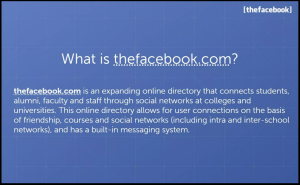
One of (The) Facebook’s opening slides outlined what the website was and how it worked. It kept things simple: The Facebook was an online directory that connected people at universities. The pitch deck slide showed the benefit of the site (user connections) alongside a key feature (built-in messaging system).
#4 — Dropbox

From AA BB on Slideshare
Dropbox got straight to the pain point with its pitch deck. They noted the gaps in existing technology: file sharing, uploading visual assets, and file losses. All these issues were very familiar to anyone who’d used the internet, which meant investors knew solving those issues was both urgent and necessary.
#5 — Shopify

From shopifyInvestors on Slideshare
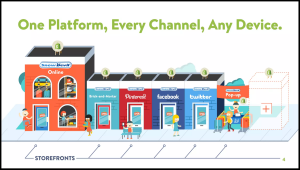
Shopify used creative visuals to illustrate the function of their business: “One Platform, Every Channel, Any Device.” The founders were trying to pitch a multi-channel commerce platform that consolidated merchants of all sizes and could be integrated into several platforms.
#6 — Netflix

From Elio Laureano on Slideshare
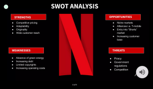
When Netflix made their investor presentation, they included a SWOT Analysis to demonstrate their value. They noted key strengths such as competitive pricing and a wide customer reach, while acknowledging weaknesses such as limited copyright. The founders also highlighted opportunities that could address those weaknesses such as alliances and an increased customer base.
#7 — Peloton

From Slidebean
Peloton’s pitch deck was short, sweet, and strong. Early into the presentation, they outlined the key benefits of their service: integrated experience, entertainment plus competition, and positive emotions. The slides themselves were also well-designed and delivered information in a way that was easy to understand.
Get Your Pitch Perfect
Maybe you’re not reinventing the wheel, but you are trying to pitch something new, exciting, and innovative. And you won’t get anything off the ground if your pitch deck is ineffective and illegible. Make the best impression on potential investors from the get-go with a well-constructed pitch deck – and of course, practice your delivery before you take the floor!
We can’t develop your business idea, but we can help construct your presentation deck to get you started. From handling the market research to conceptualizing concept designs, Kika will create the pitch deck you need to secure investment funding. You bring the business model and we’ll bring the design package for the ultimate brand partnership.
Get in touch with us for a free marketing consultation today!


